Customers often ask us for a way of carrying out certain evaluations in their ticket system and displaying them clearly. We offer you various ways to do this:
Excel Dashboard
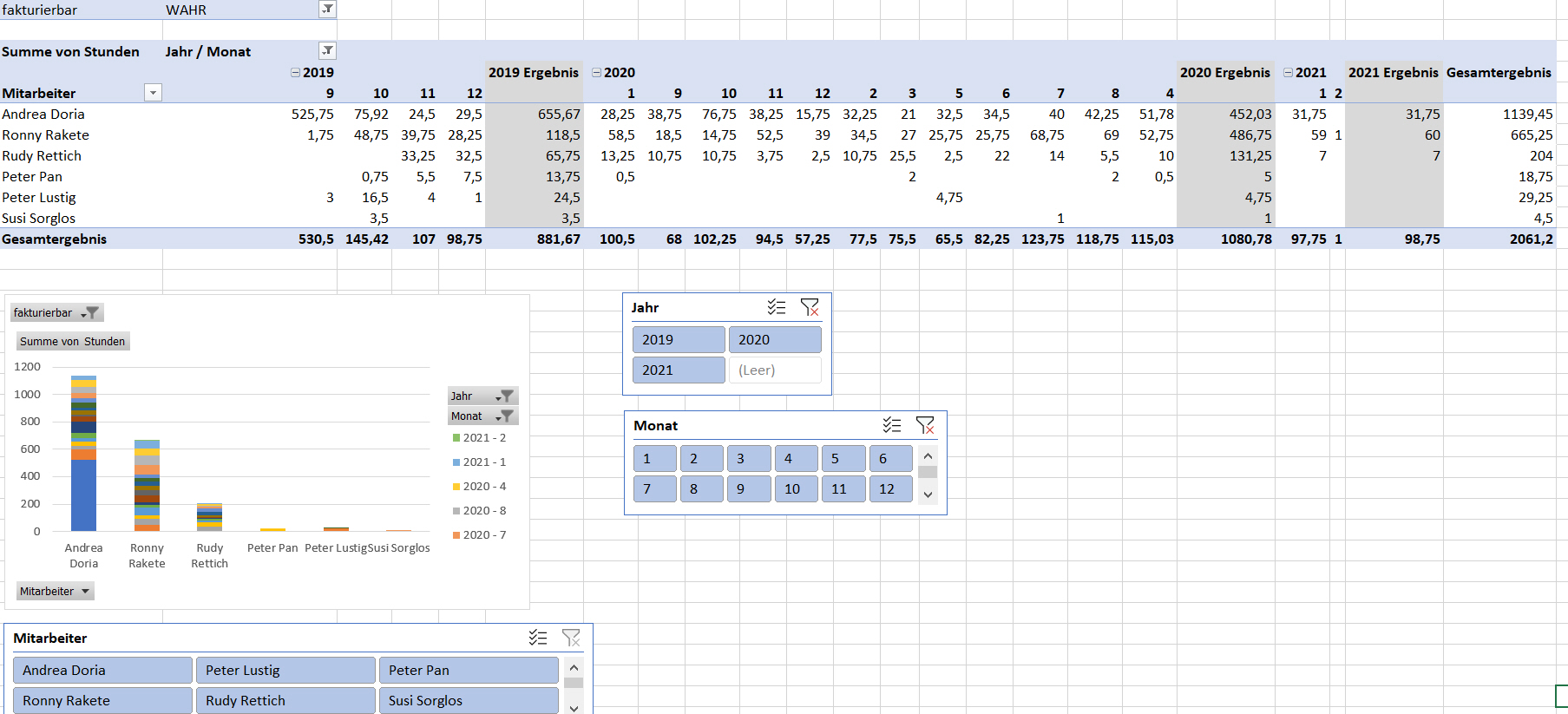
If you have an Office 365 license, we can configure a custom dashboard for you based on Excel. This processes data that was previously exported and downloaded from your ticket system using the Report function. This solution offers extensive functionality , eg pivot tables and complex calculations are also possible. If you don’t need an evaluation within seconds, but complex and extensive calculations of your data are important, you should consider an Excel dashboard:
Charts Web Part
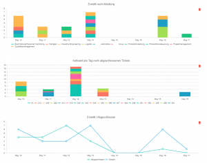
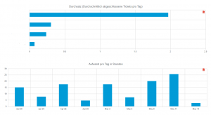
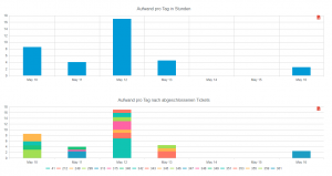
Your HelpDesk LTRS 365 already offers a basic functionality for reports. Using a special charts web part, we can create a dashboard for you that accesses and evaluates your SharePoint lists directly. There is no need to create reports and download data before generating a dashboard, and you don’t have to switch between applications, you stay in the SharePoint environment. This dashboard complements and extends the reports function already included in HelpDesk. The data is processed immediately, without prior downloading. You get your clear evaluations literally at the push of a button. If you value fast data presentation and ease of use, a dashboard created with the Charts web part is right for you:
We would be happy to advise you on which dashboard variant makes the most sense for your purposes!